These logos are not actual clients I worked for. I wanted to challenge myself to re-create some logos I see around my city. I tried to imagine what the client would want. All of these logos are already very familiar with the people around this city, so I had to keep the colours the same, or very similar. Since many of these companies have made road signs for these logos, the typeface and shapes need to similar to what they have now (with the exception of Fourteen).
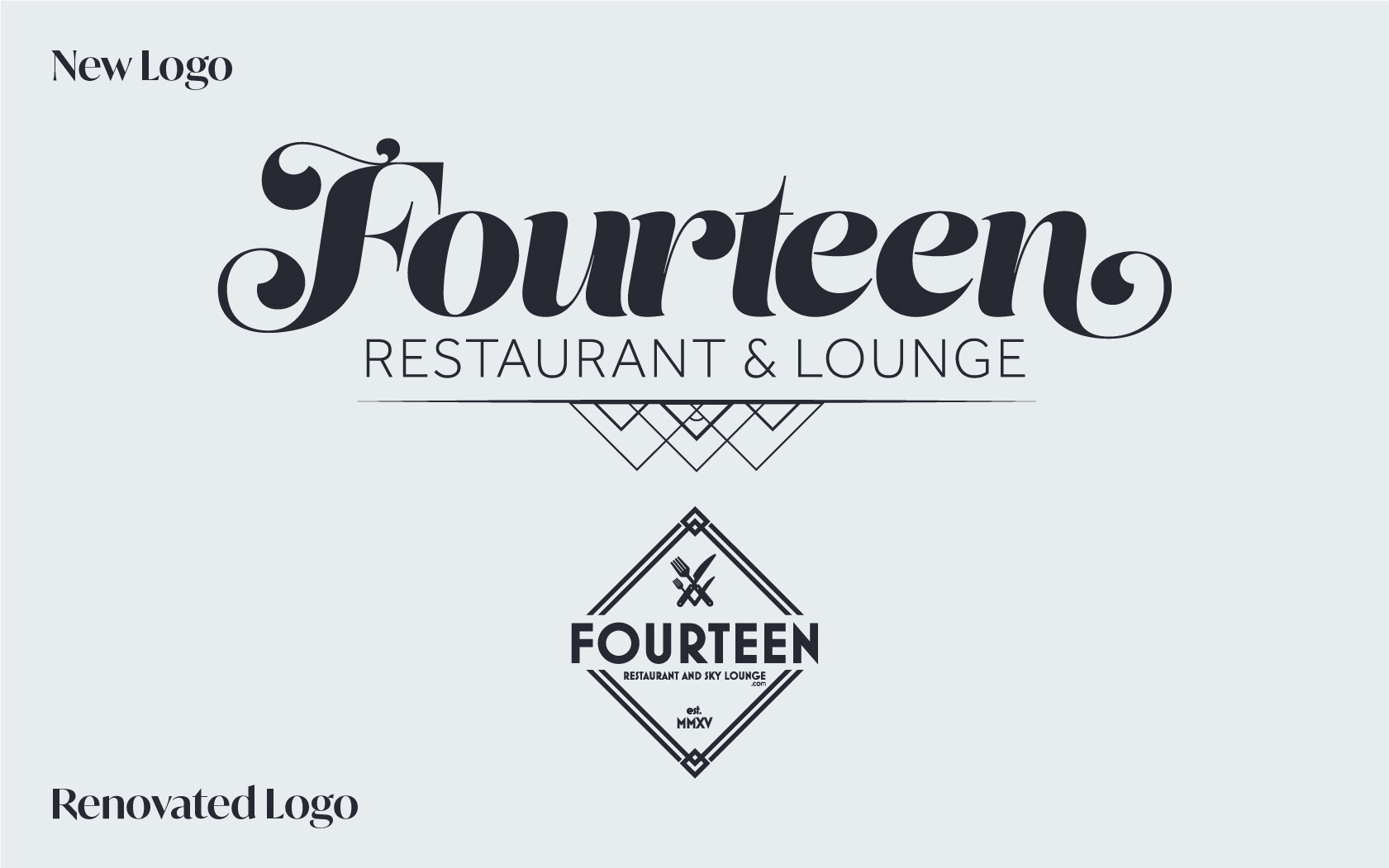
Fourteen Restaurant and Sky Lounge is a luxury restaurant located on the 14th floor overseeing the Detroit River. For Fourteen Restaurant and Sky Lounge I found their logo did not fit with what they want to portray. The box around the logo and the immense amount of content inside the box makes it feel cluttered. I removed the ".com" and "est. MMXV" because those are outdated design methods. The shapes inside of the decorative design under "Restaurant and Lounge" has 14 shapes inside of it. I stuck with the 1920's theme by keeping a geometric sans-serif typeface. The main typeface needed to be changed, and it needed to portray luxury. Their original colours are black and white, and the menu colours are black and gold. I find those colours are too harsh on the eyes, and changed it to a more subtle black to modernize it.
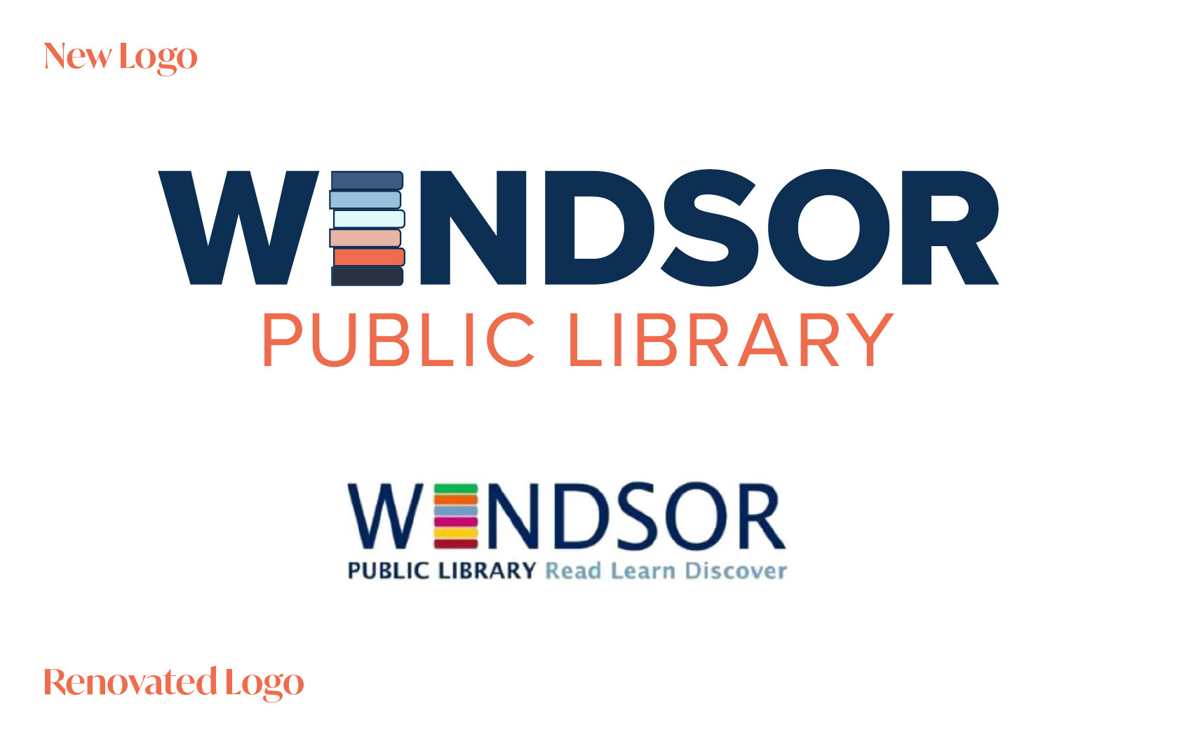
The Windsor Public Library logo is already unique, but I didn't think the font, colours or tagline portrayed how far they have evolved throughout time. They've become more modern, adding e-books, audiobooks, manga and plenty of other features for the public to enjoy. I went with the classic Windsor blue, but I added in orange to give it contrast. It still feels fun, but the colours coordinate better. I kept the book that makes up the "I" because that's a standout feature. The word "Windsor" is longer and larger than public library because I want people to recognize the book logo as being the Windsor Public Library without needing to see the rest of the words. The tagline was unnecessary because everyone already knows they can read, learn and discover at a a library. The font is much easier to read due to the colour contrast and geometric typeface.
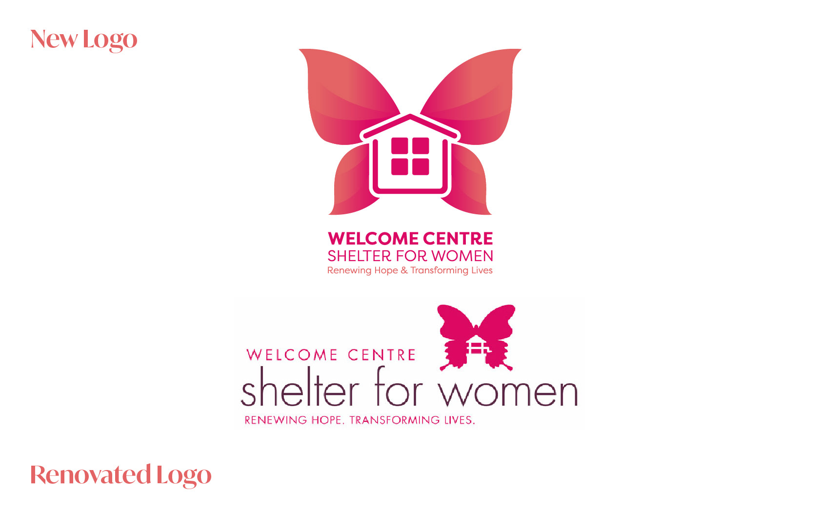
The Welcome Centre Shelter for Women is a non-profit organization dedicated to providing emergency shelter, food, support, political education/action and advocacy to women and families experiencing homelessness within a safe, stable, and inclusive environment. I found the logo extremely busy and unorganized. The hot pink is the most recognized around the community, and that needed to stay with the logo. The butterfly and house is also an iconic symbol, but it needed to be streamlined and eye catching. The subtle gradient change on the butterfly adds a pretty modern touch of depth.
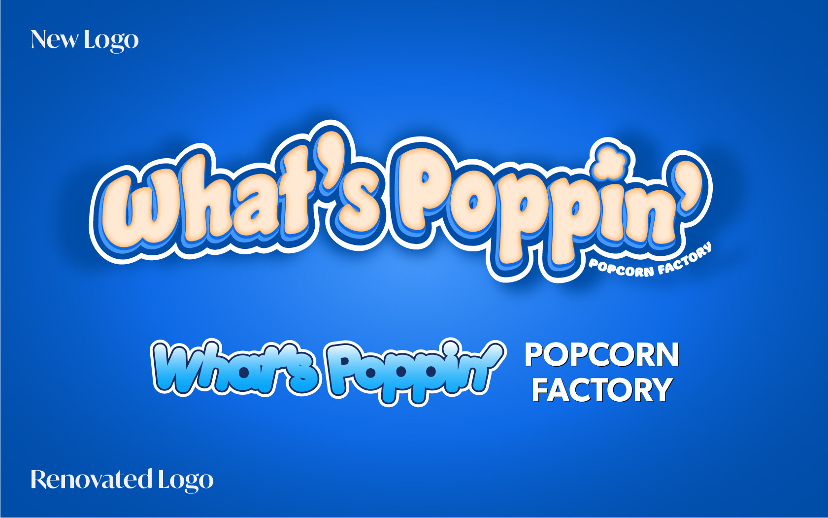
What's Poppin' Popcorn factory is a Windsor-made popcorn and summer treats company. They sell at farmers markets and craft shows. I kept the colours and added in more yellow to their logo since they only use the logo when advertising the popcorn. I wanted to incorporate all of the elements in the logo rather than mixing and matching them depending on the product to build brand recognition. The original logo had improper spacing. The kerning and tracking made it hard to read. I kept the close tracking in the new logo, but created a more exciting logo with more depth. The "Popcorn Factory" part looked awkward on the side in the original logo. I wanted to embrace that text into the logo to make it feel harmonious. I added the popcorn piece in the "I" that way they could use that as a brand icon.
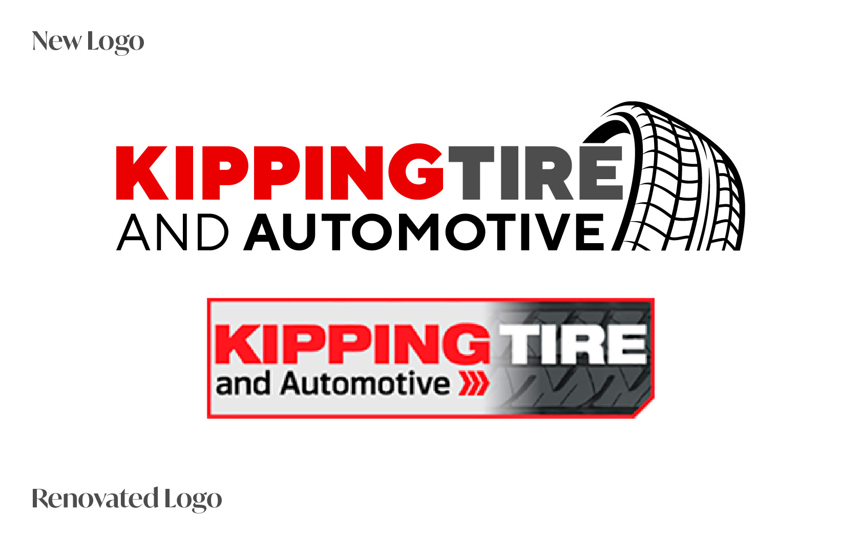
Kipping Tire is a local tire and automotive shop. By getting rid of the box, changing the typeface, and adding a more appealing tire vector icon, it gives it a cleaner look. I got rid of the three arrows because they do not enhance the logo.
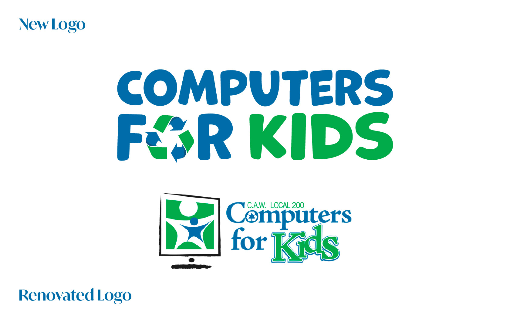
Computers for Kids is a registered charity which recycles donated computers for children in need. With the amount of online learning and technology used in classrooms today, it is essential for children to have a decent working computer. I replaced the old typeface for a more youthful typeface, and took the original "O" on computers, and used it as inspiration for the vector icon in "For". I didn't want to take away all of the icons, just reduce it down a bit. The C.A.W is no longer needed as they have changed to Unifor, and no longer attach the logo onto it unless they are going to an event or need to hand out flyers.
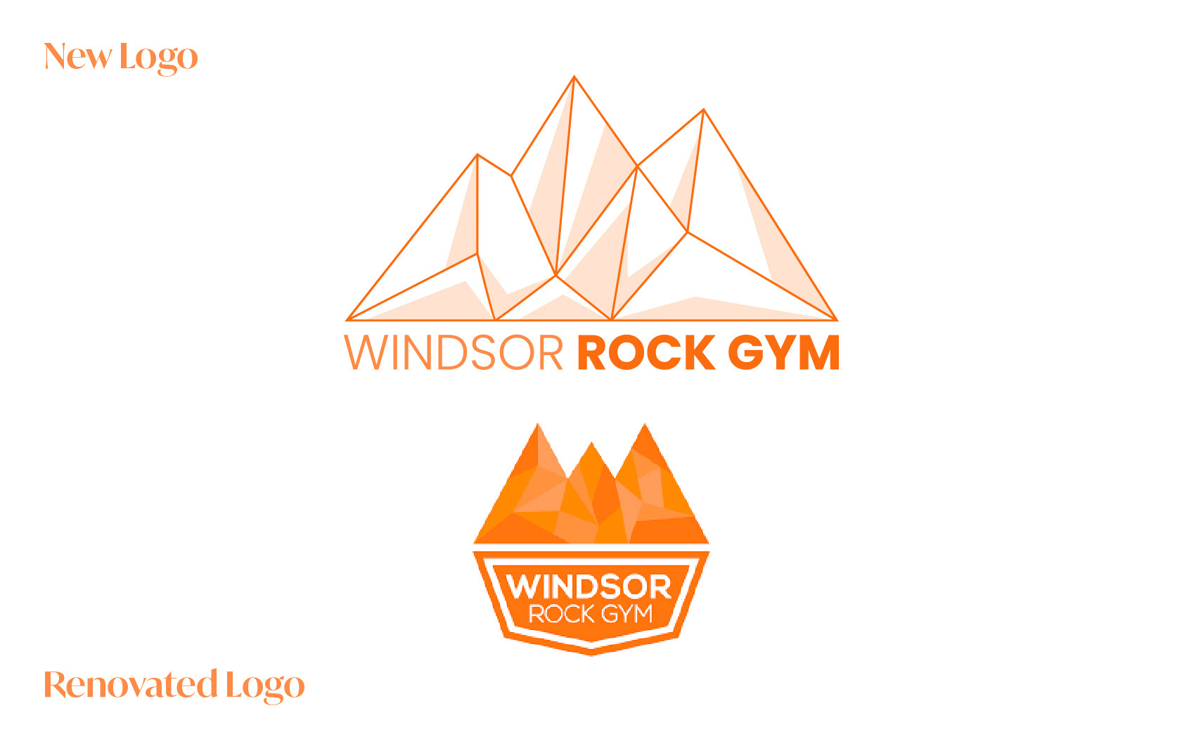
Windsor Rock Gym is Windsor's only rock gym. They're known for bouldering due to it being a smaller gym. They have a very tight and friendly community. I don't mind their old logo, but I personally thought it looked outdated because of the low-poly style. That was used by many designers back in the early 2010s but it's been phased out. I wanted to keep the angular theme but make it more modern. By putting Windsor Rock Gym all on one line, it makes it feel more balanced.
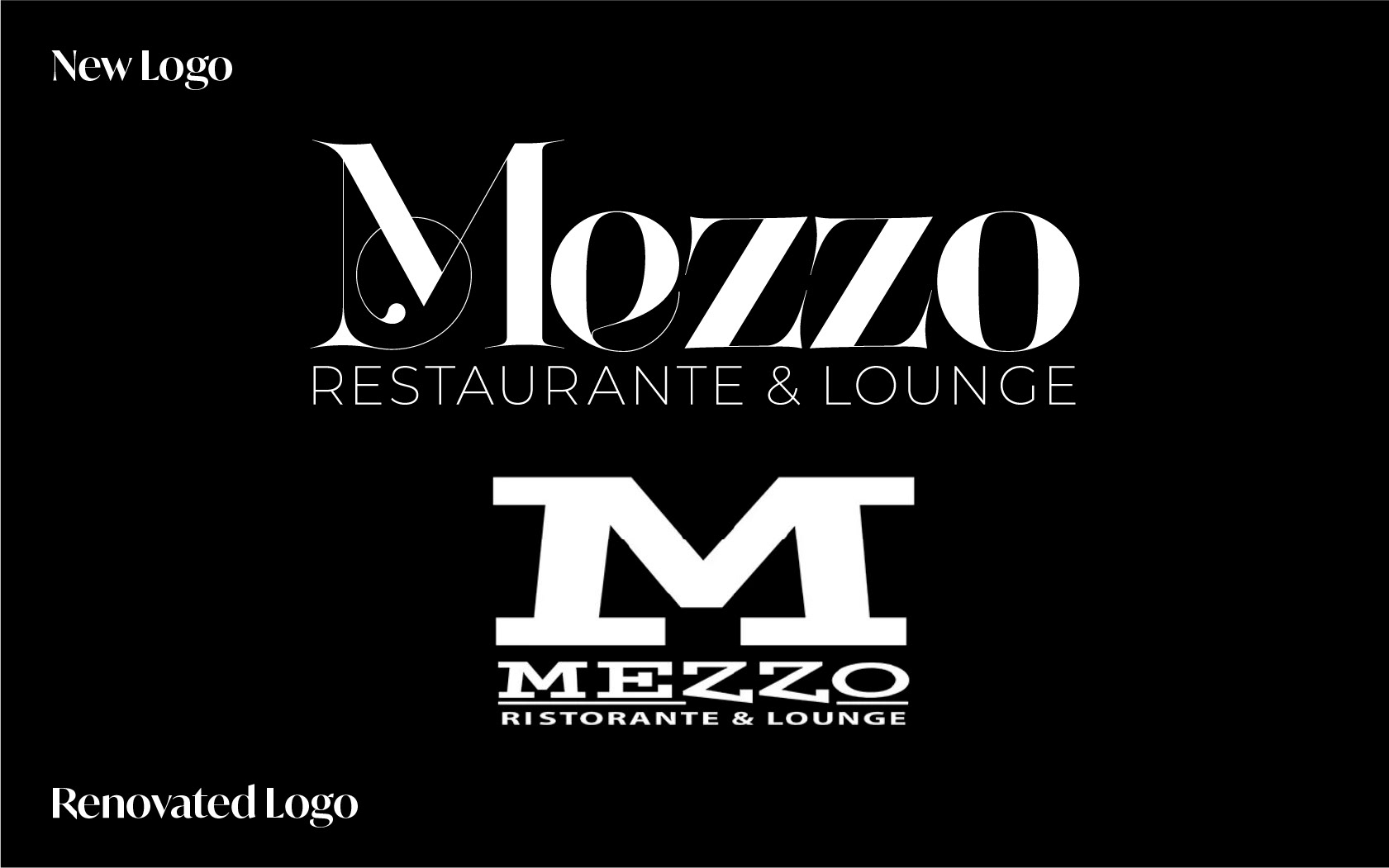
Mezzo Restaurant & Lounge is a high-end Italian restaurant located in Little Italy in Windsor. The logo didn't feel contemporary or posh enough for this chic restaurant. I wanted something eye-catching and dynamic. This new typeface gives me elegance and sophistication. There was little thought put into the line that stops at the two Z's. The kerning and tracking were not well thought out. The "M" is often used in their branding, but it's chunky and it feels like it's screaming at me, rather than inviting me in. This new "M" feels mysterious and elegant. It makes me want to know what else Mezzo has to offer. Their theme is black and white which I don't mind. There aren't too many black and white logos for fancy restaurants in Windsor.